Steap
The process
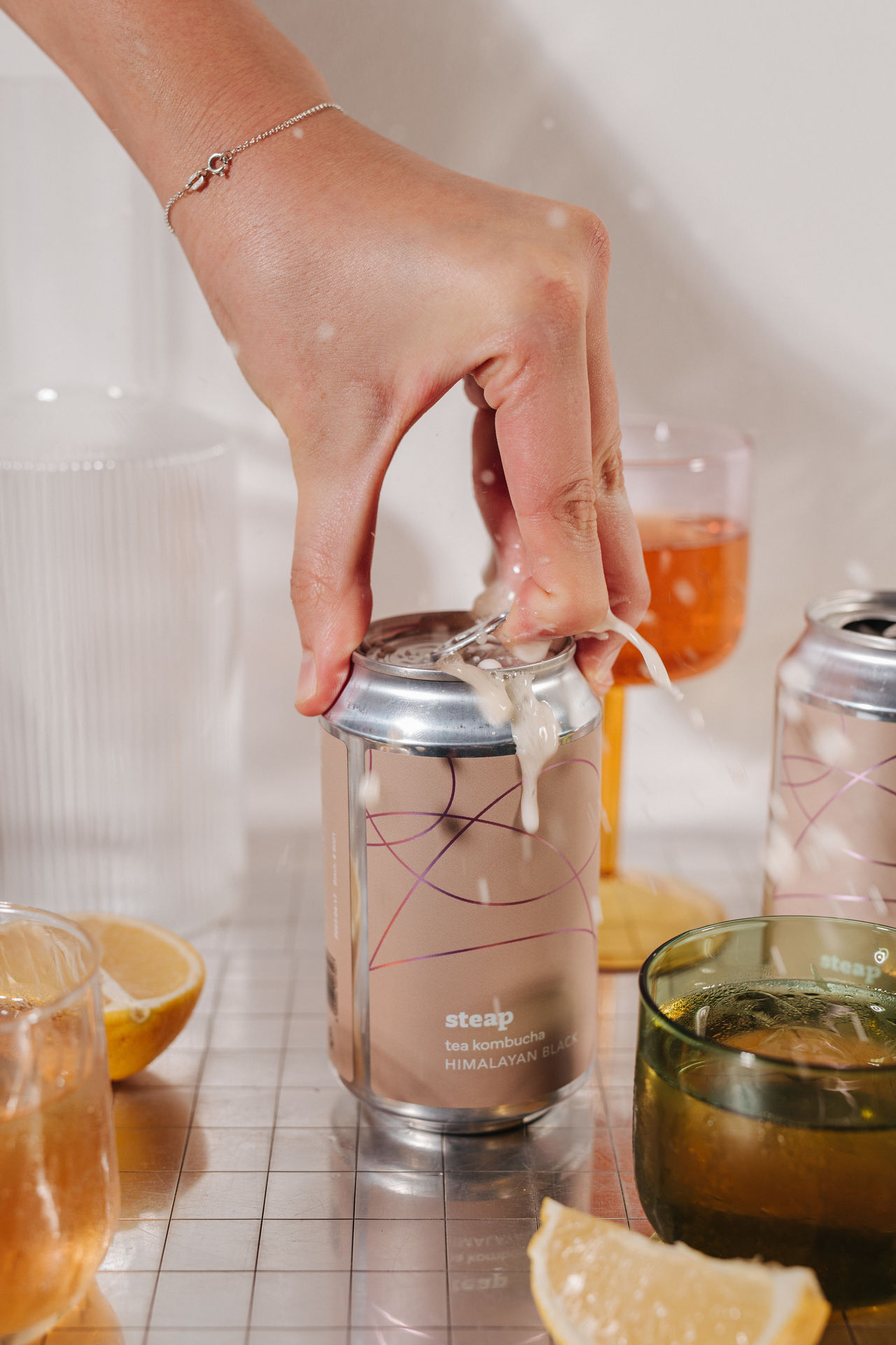
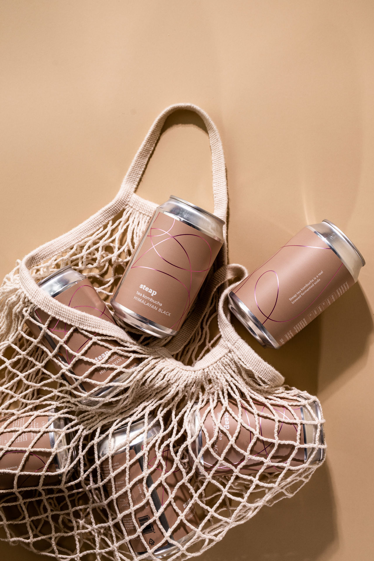
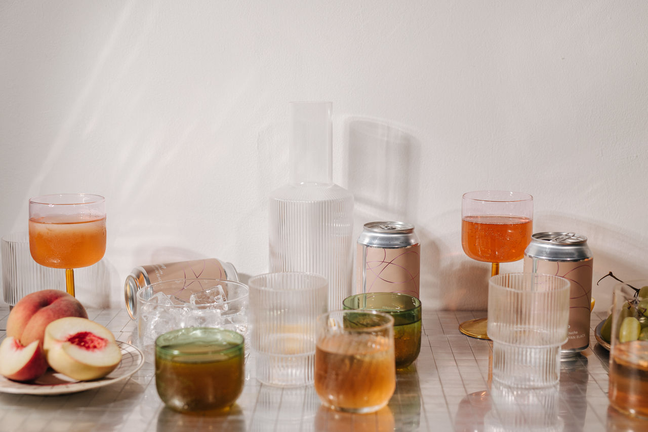
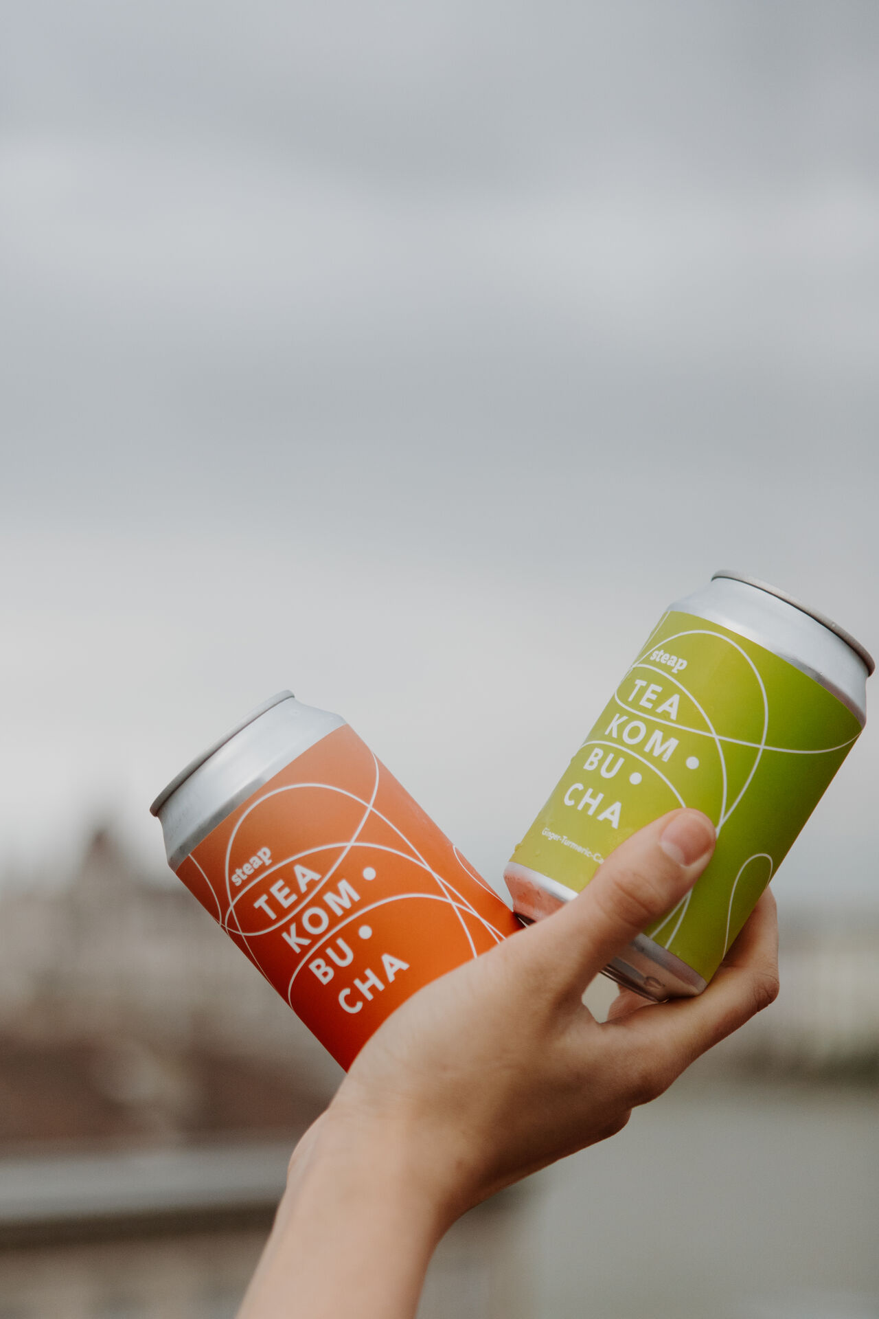
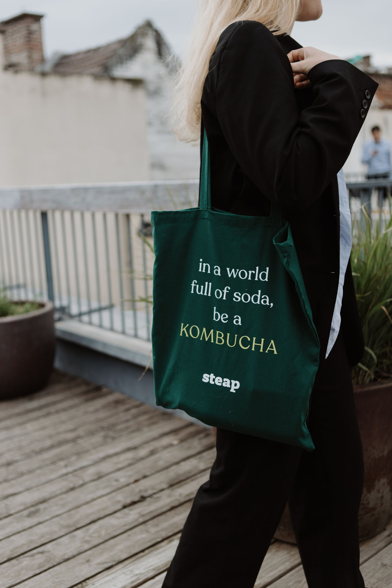
We tasted a drink that is fresh, natural and undeniably cool – so we made a design that resembles it.
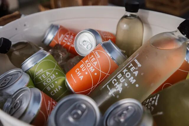
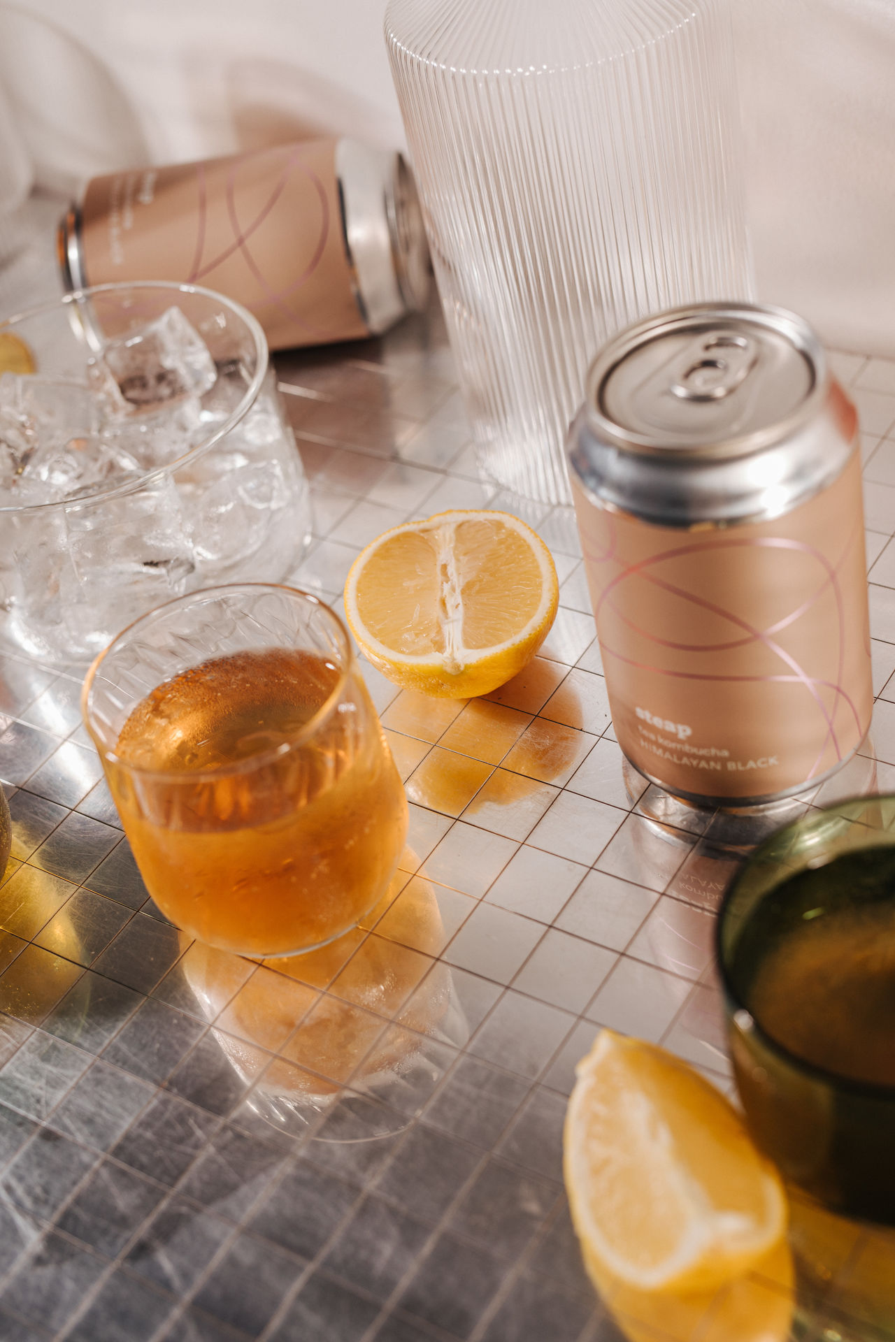
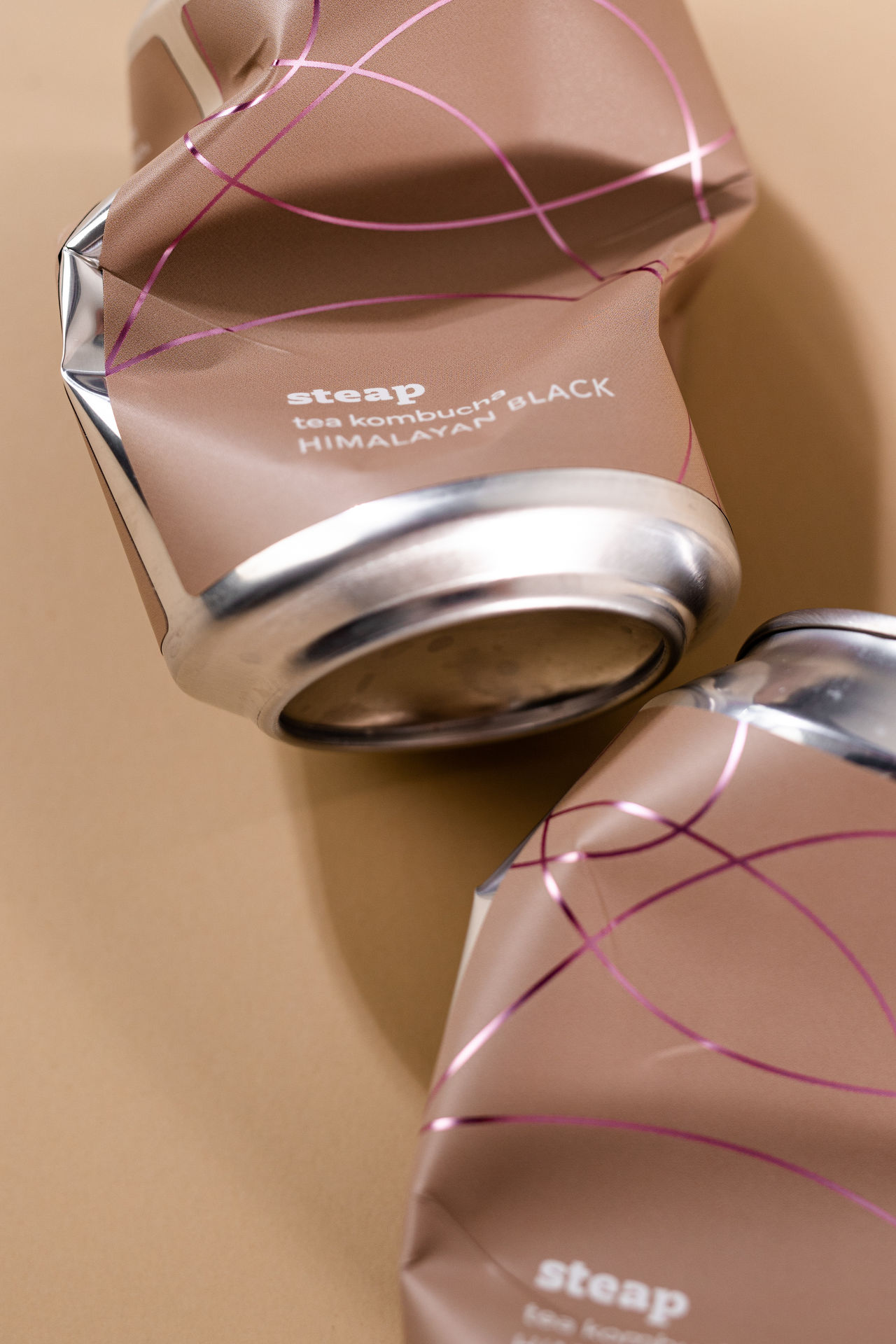
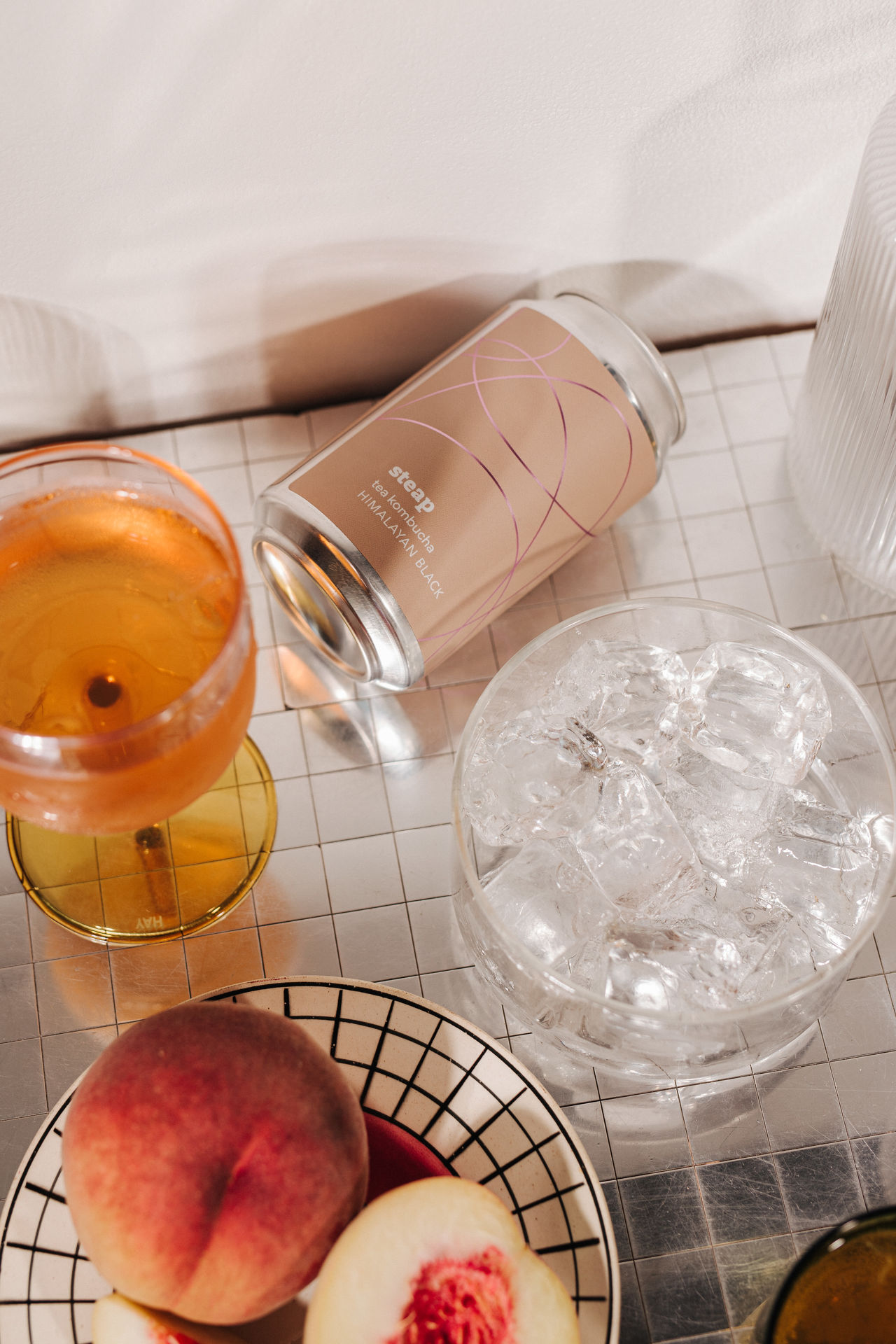
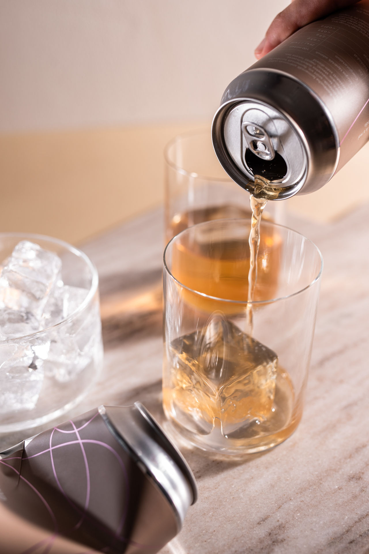
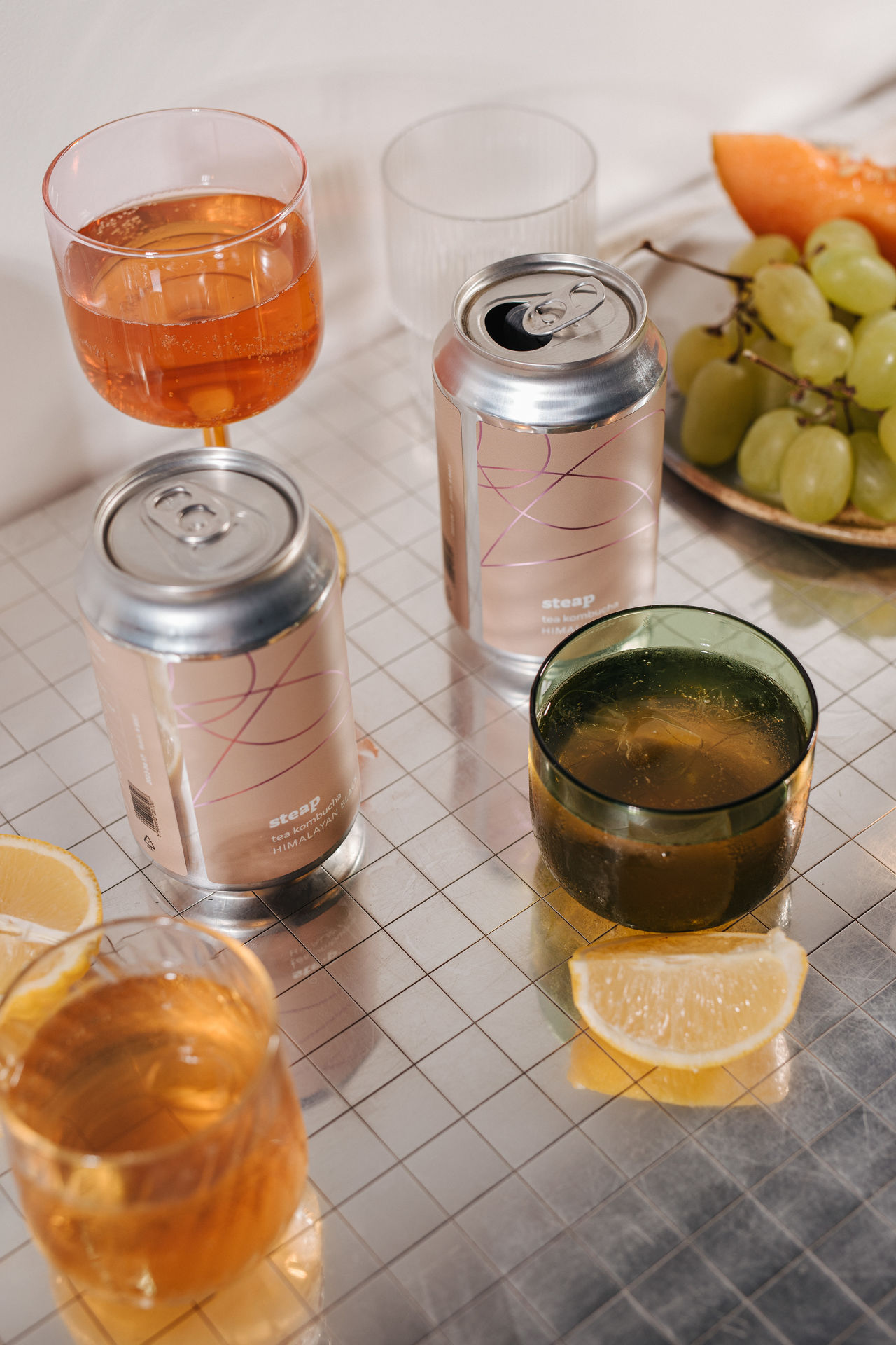
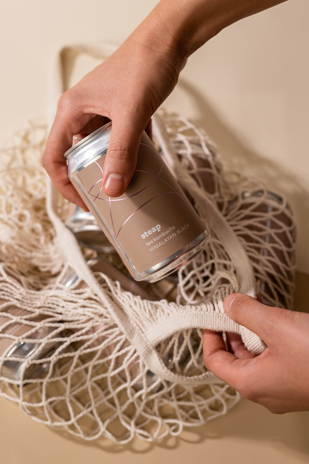
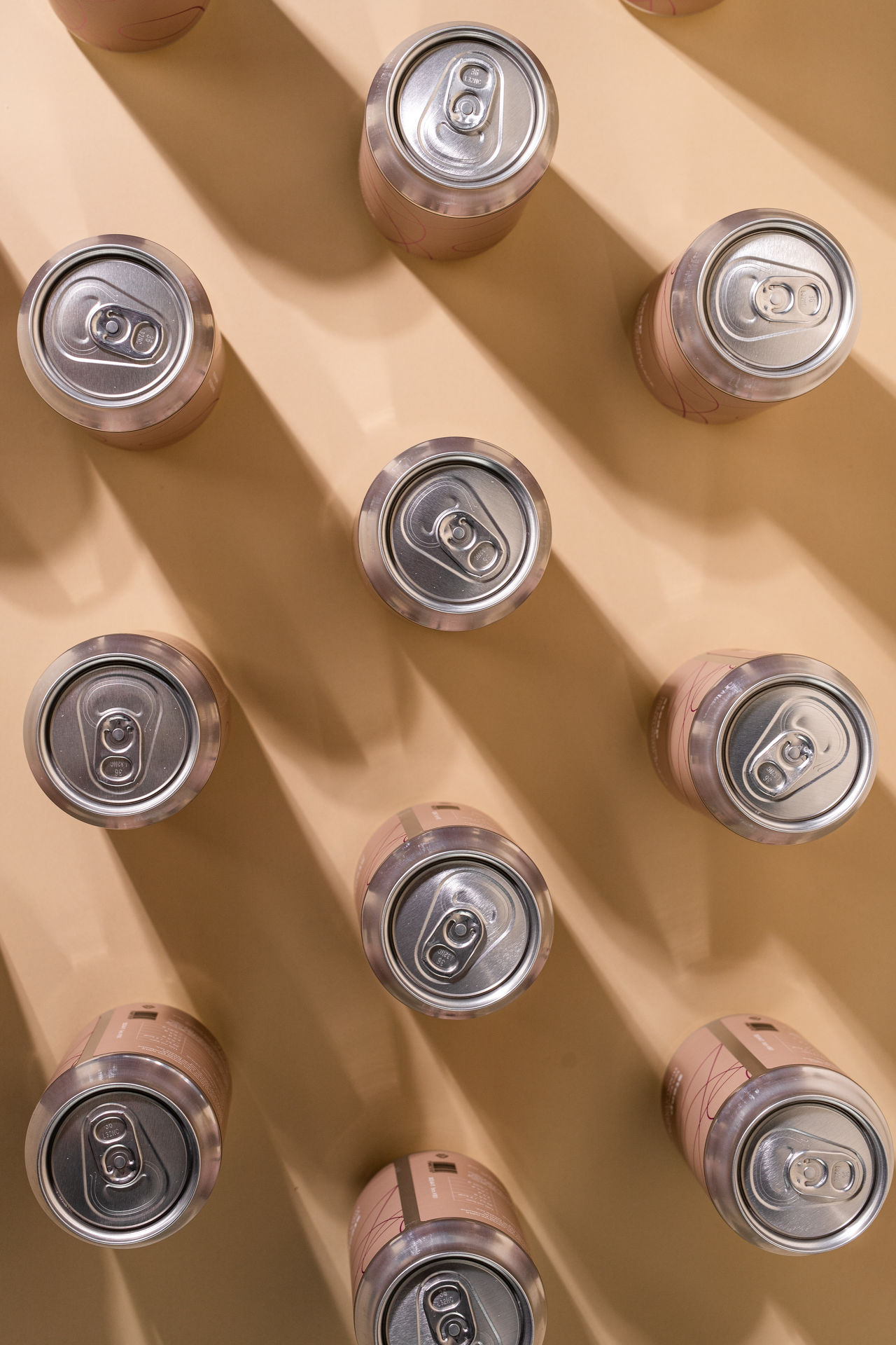
Kombucha is a drink that brings tradition to the present. With natural tea from the Far East, cultures of bacteria that ferments them, and a product that is sparkly in taste but low in calorie, Steap is truly a refresher that stands its ground in today’s demand for healthy, but exciting drinks. With this contrast in mind, the backbone of the visual identity that we imagined reflects this duality. The organic dynamism of winding lines communicate the lightness, natural sources and traditional procedure of the drink, while the vibrant and shining complementary colors evoke the gripping, sparkly taste that is present in every sip of kombucha. In addition to the graphical identity, we organized and art directed a brand photography where lights, materials, colors and action created a visual unity that fits the graphics, and of course, the center of it all: kombucha.
The outcome is a clear contrast of naturality and excitement, which is an eye-catching combo for those who seek products of great quality that show something new in taste but never fail to be natural and healthy.
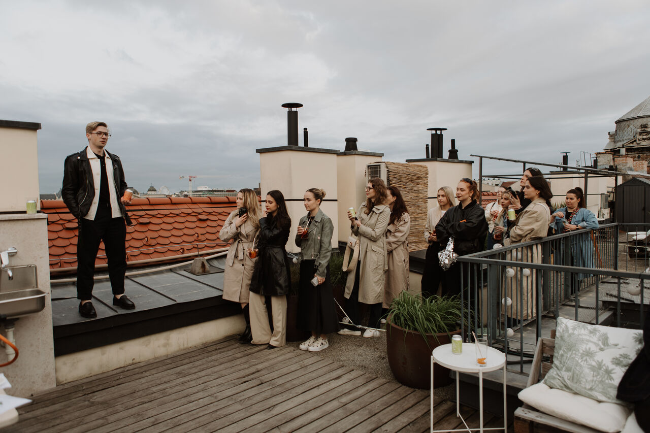
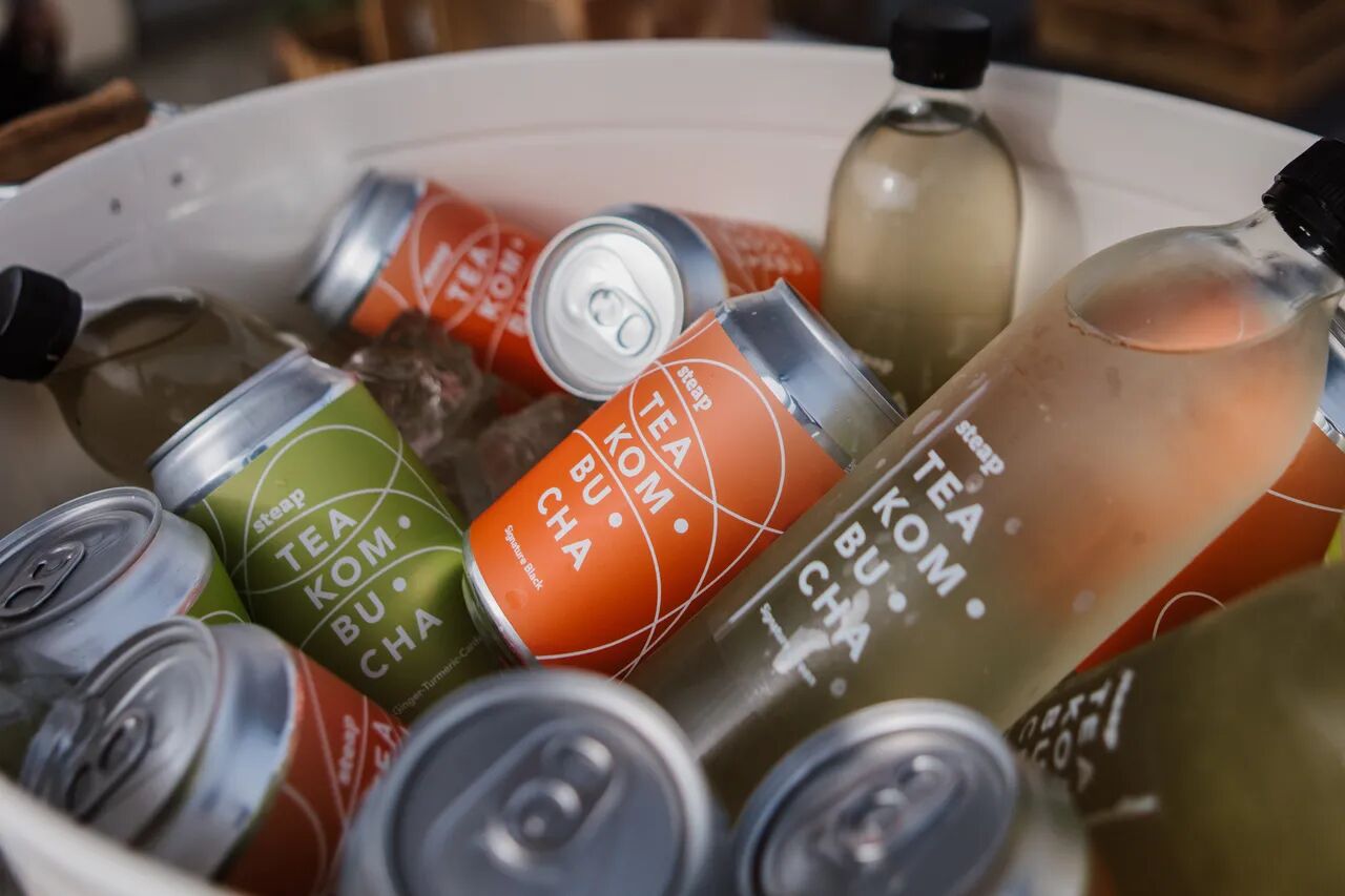
After designing the packaging, we launched Steap at an event this spring, with new flavours and packaging on the shelves.
At the tasting, we not only welcomed the trade press, but also old/new friends to let everyone in on the secrets of kombucha. Ricsi told us about the tea, how it is made, its curiosities and of course his own story.
You can read more about the man who sealed the first drink in a metal can, free of artificial additives and offering a unique taste experience, in articles such as Forbes and We Love Budapest.
services: design & pr
year: 2022, 2023
client: Steap