Home of Solinfo
The process
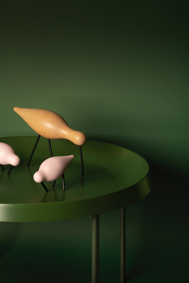
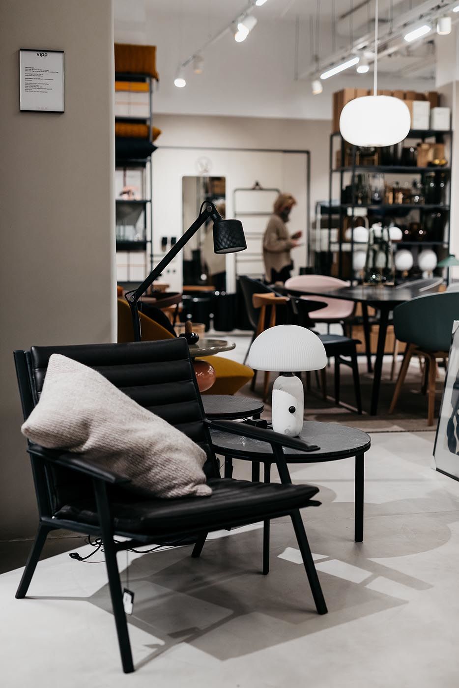
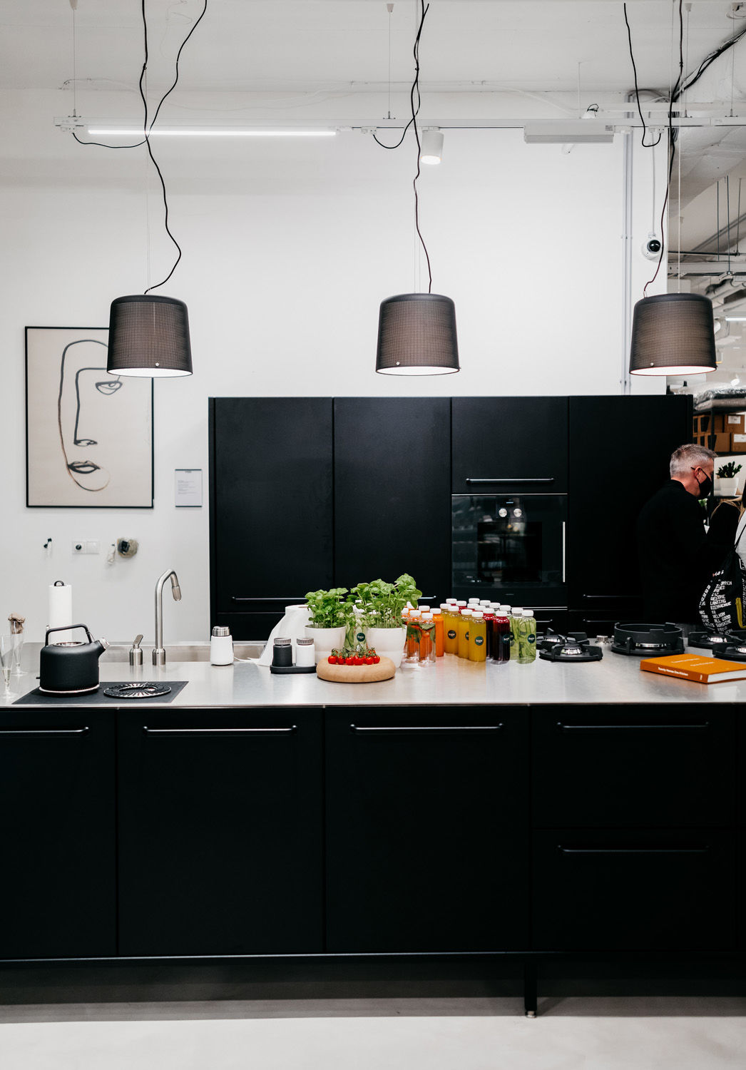
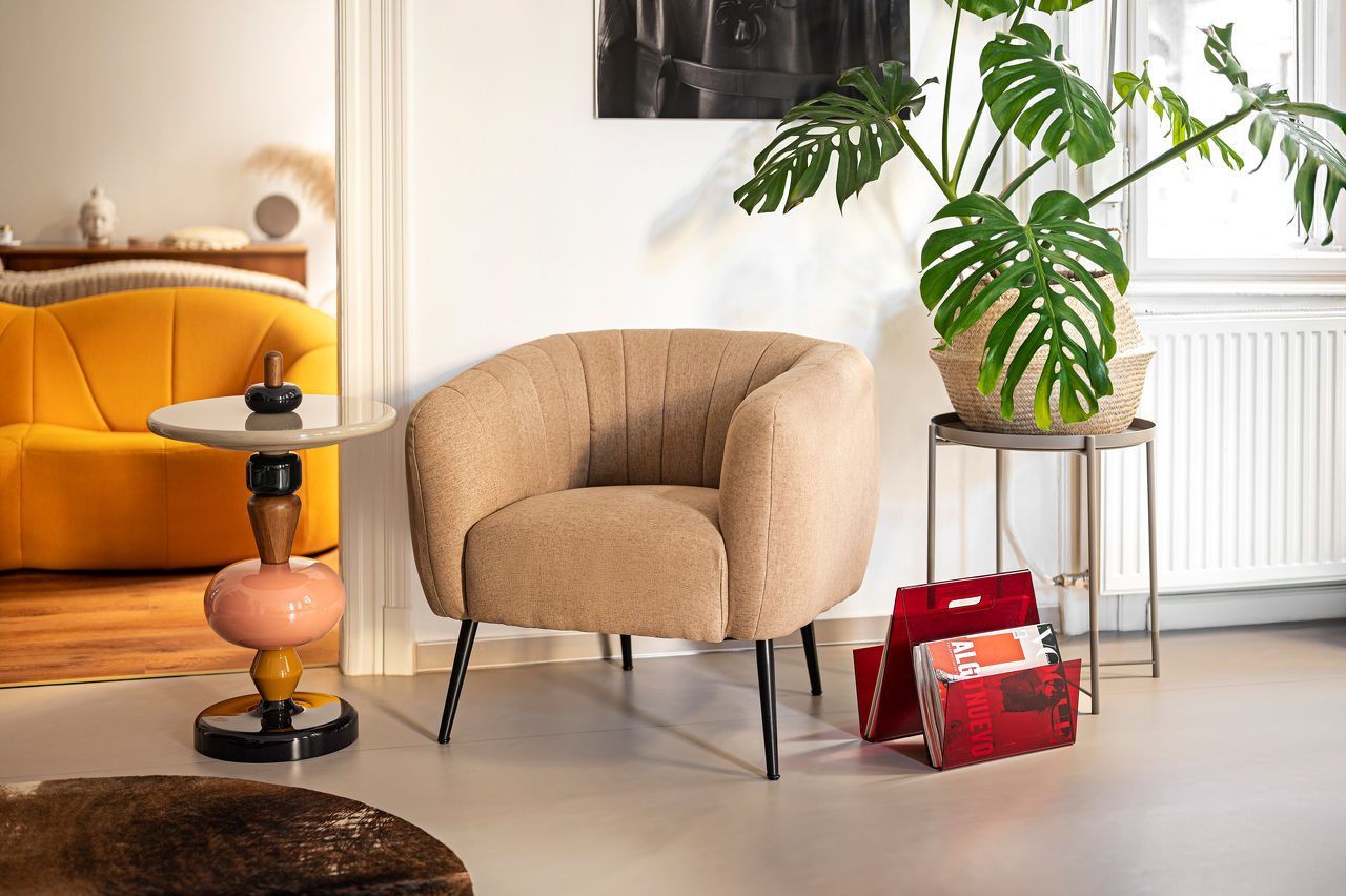
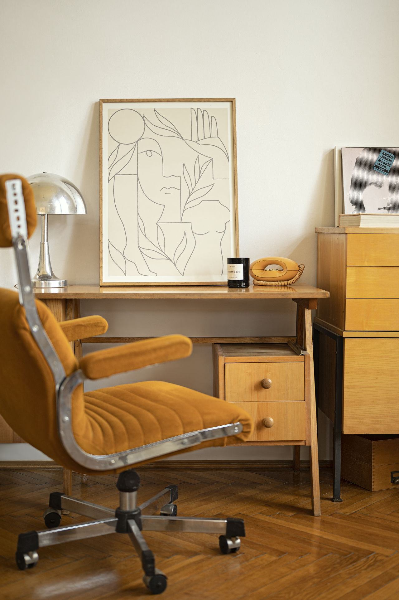
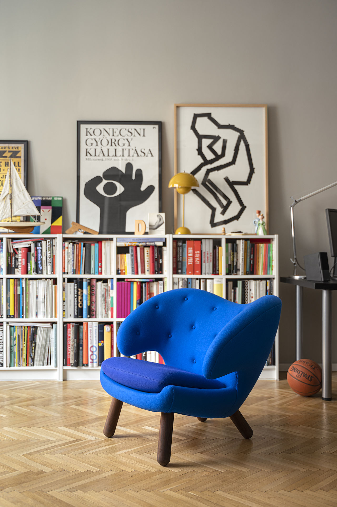
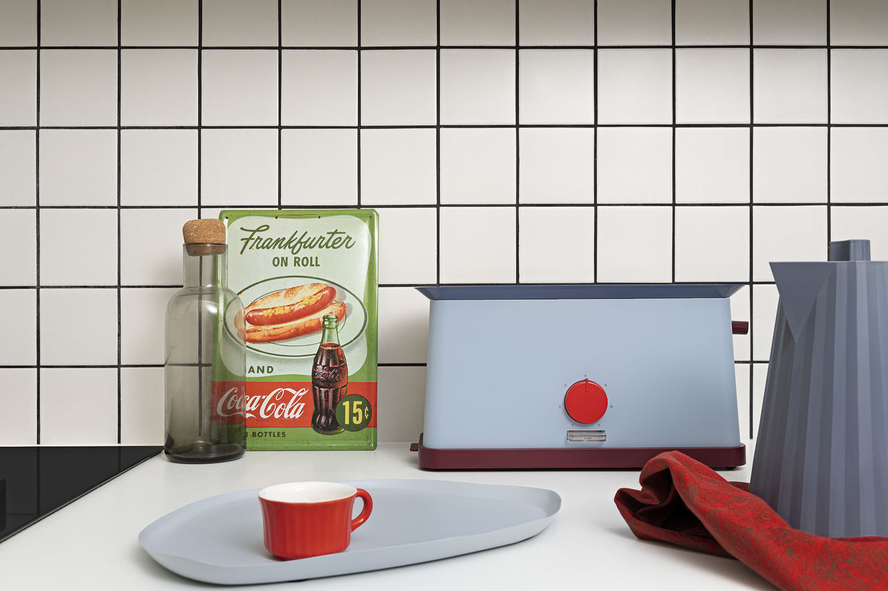
Designing the image of Home of Solinfo, Scandinavian culture and design was an endless inspiration for us. In the end, we wanted to grasp the essence of this: minimalism and harmony. The ligature, composed of one of the most characteristic punctuation marks of the northern languages, functions as a symbol in the Home of Solinfo logo. On the other hand, this is a reference to the Scandinavian design tradition. The choice of color was intended to capture the atmosphere of the Scandinavian pine forests, which exude naturalness and simplicity.
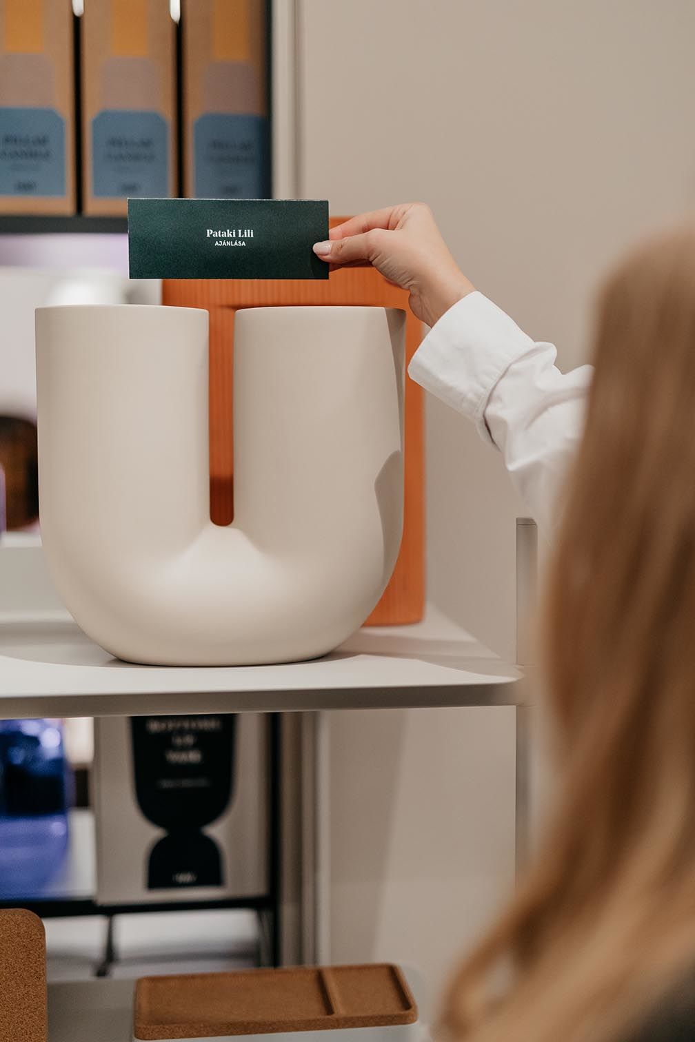
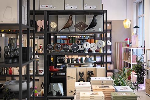
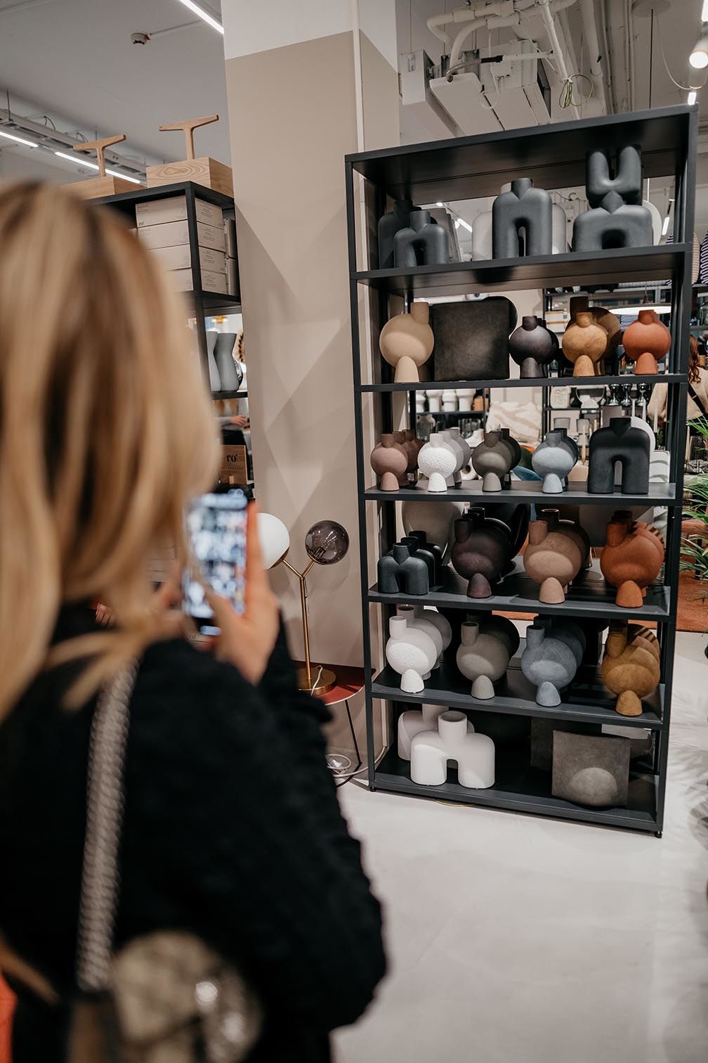
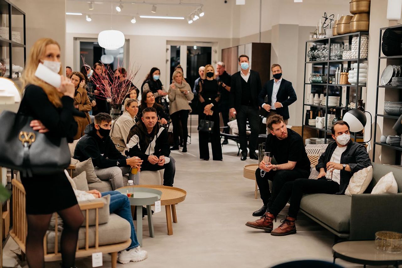
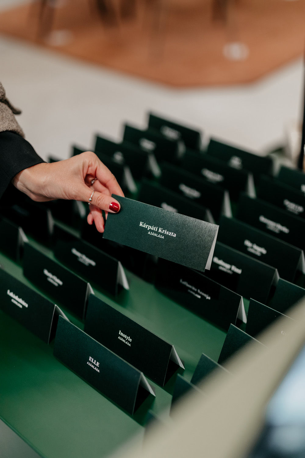
For the opening we invited our guests to an exciting press breakfast to showcase the contemporary design products of Home of Solinfo and bring them closer to the Scandinavian sense of life, the store and the brand. The event was sparkling with some delicious meals and a little extra was waiting for them. Each participant could give their favorite piece a recommendation card. We drew lots, and three lucky winner could take home their favorite designer accessory. In addition to the classic tools, we focused on creating an experience for the press.
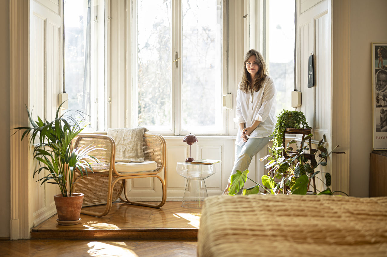
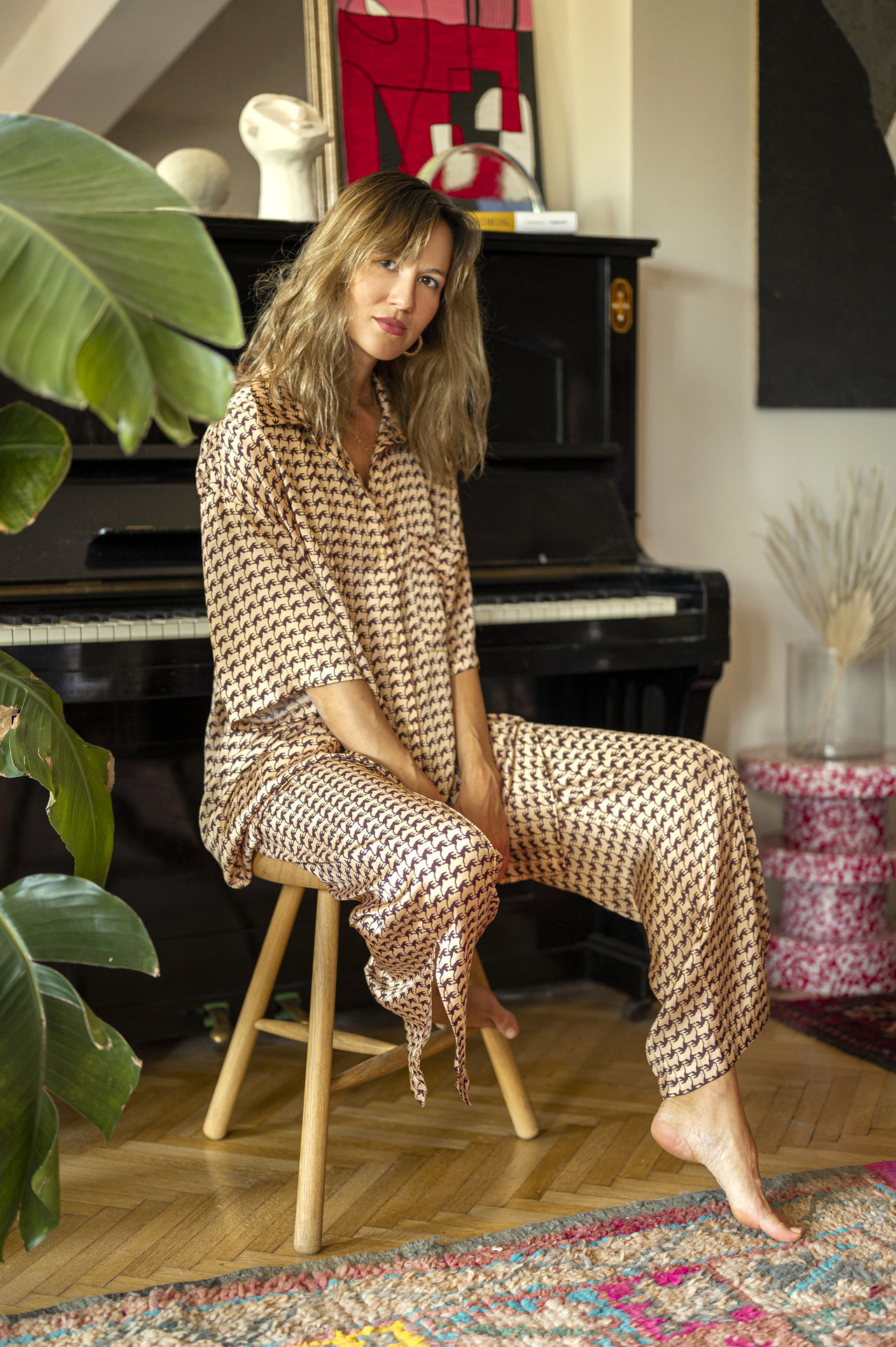
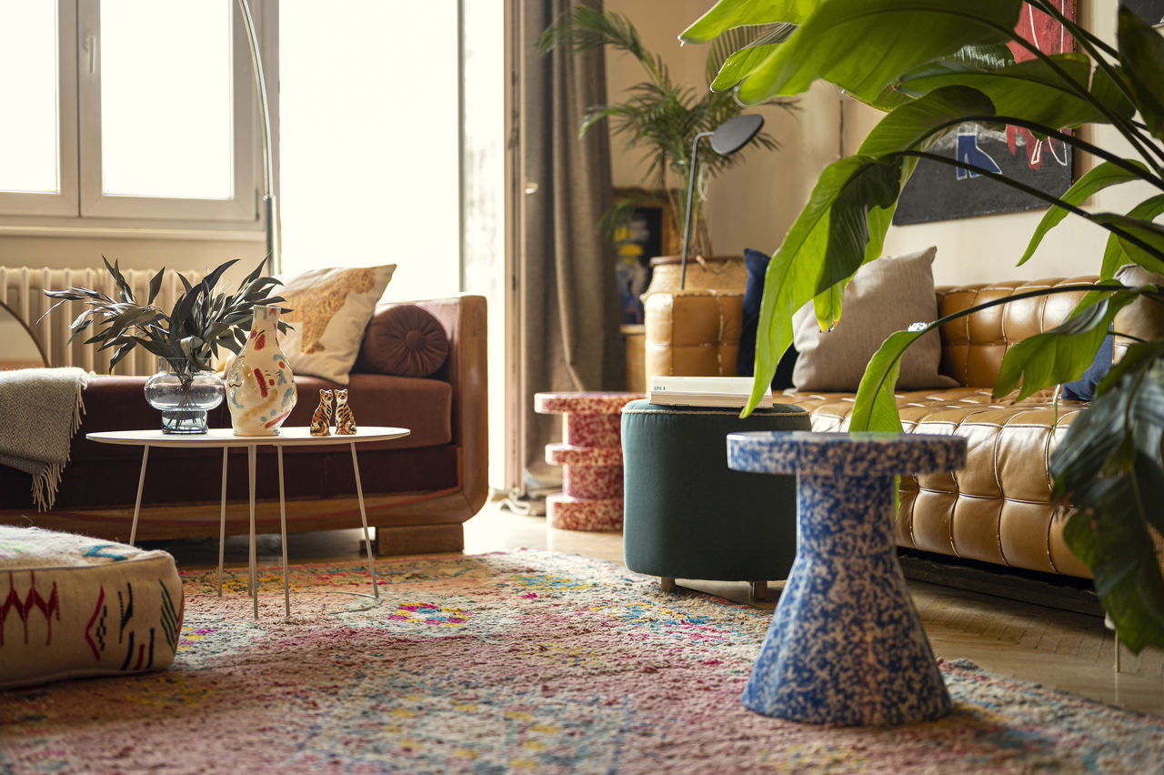
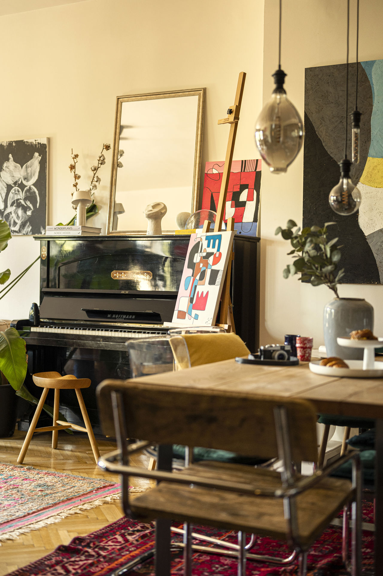
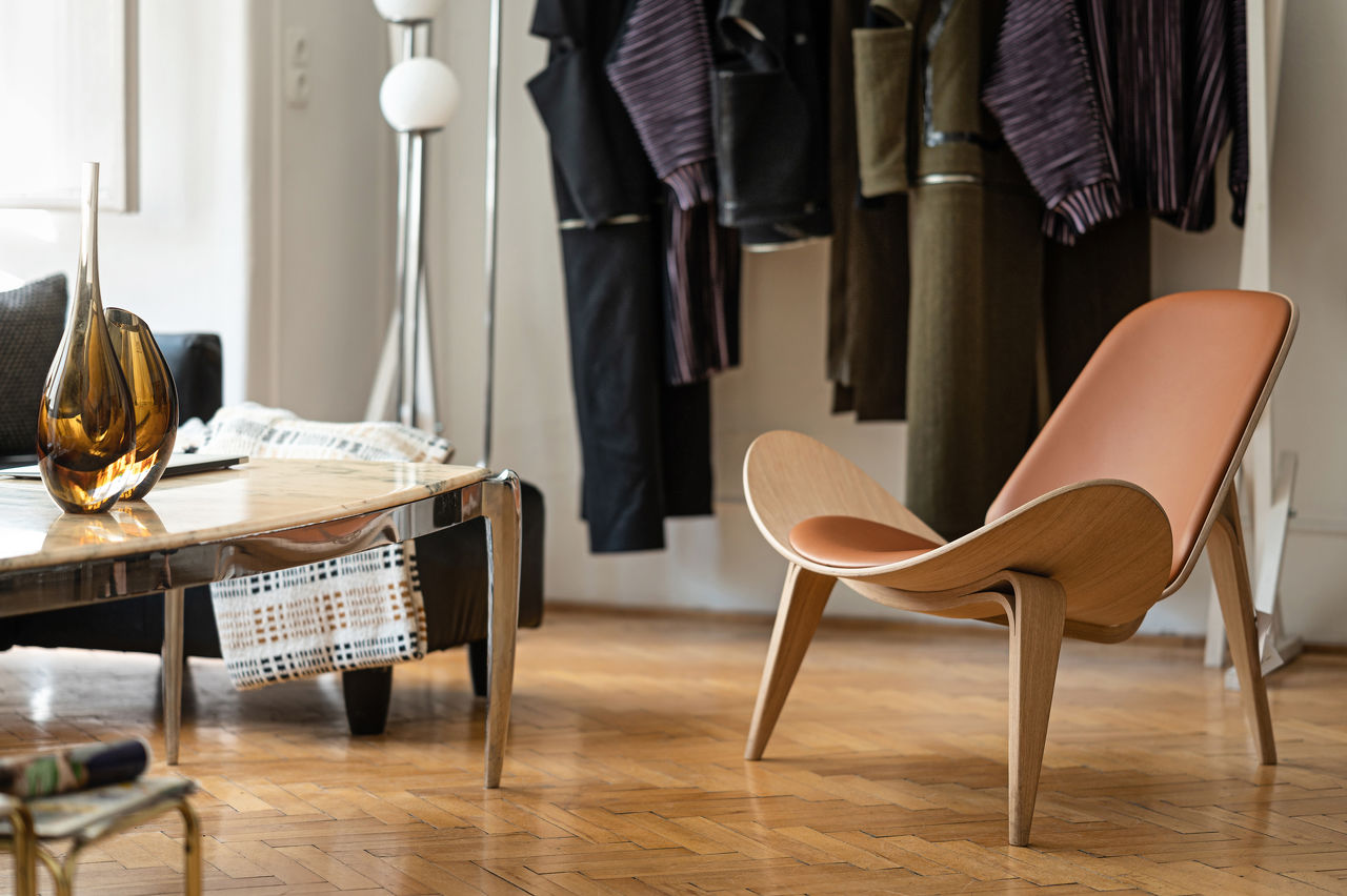
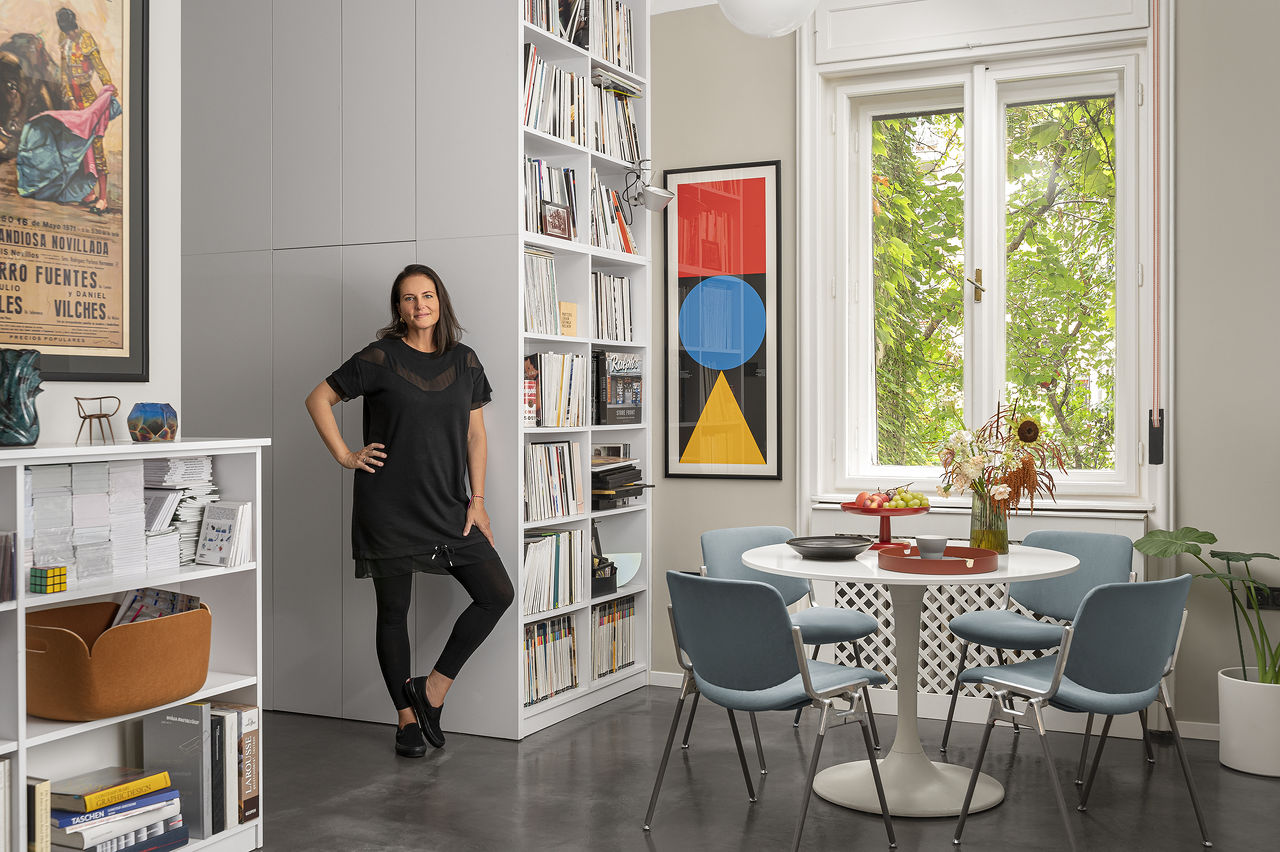
On the social platforms, we combine the Scandinavian minimalism with an elegant, clear voice, and the determining pine forest color returns in the pictures. We also started a blog where we worked with influencers who work in create businesses – recently Kaptay Annamari, Szegedi Kata-Benus Dani duo, Osvárt Judit, Kászonyi Dorka és Kozma Norbi and more to come. They let us in to their home/studio, so that we can appreciate their style and harmonious interior and design.
services: marketing strategy & branding & social & pr
year: 2021-2024
client: Solinfo