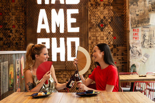
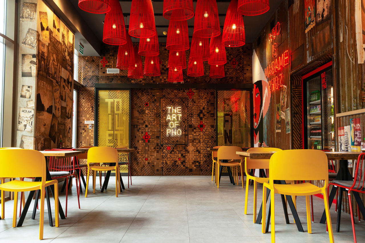
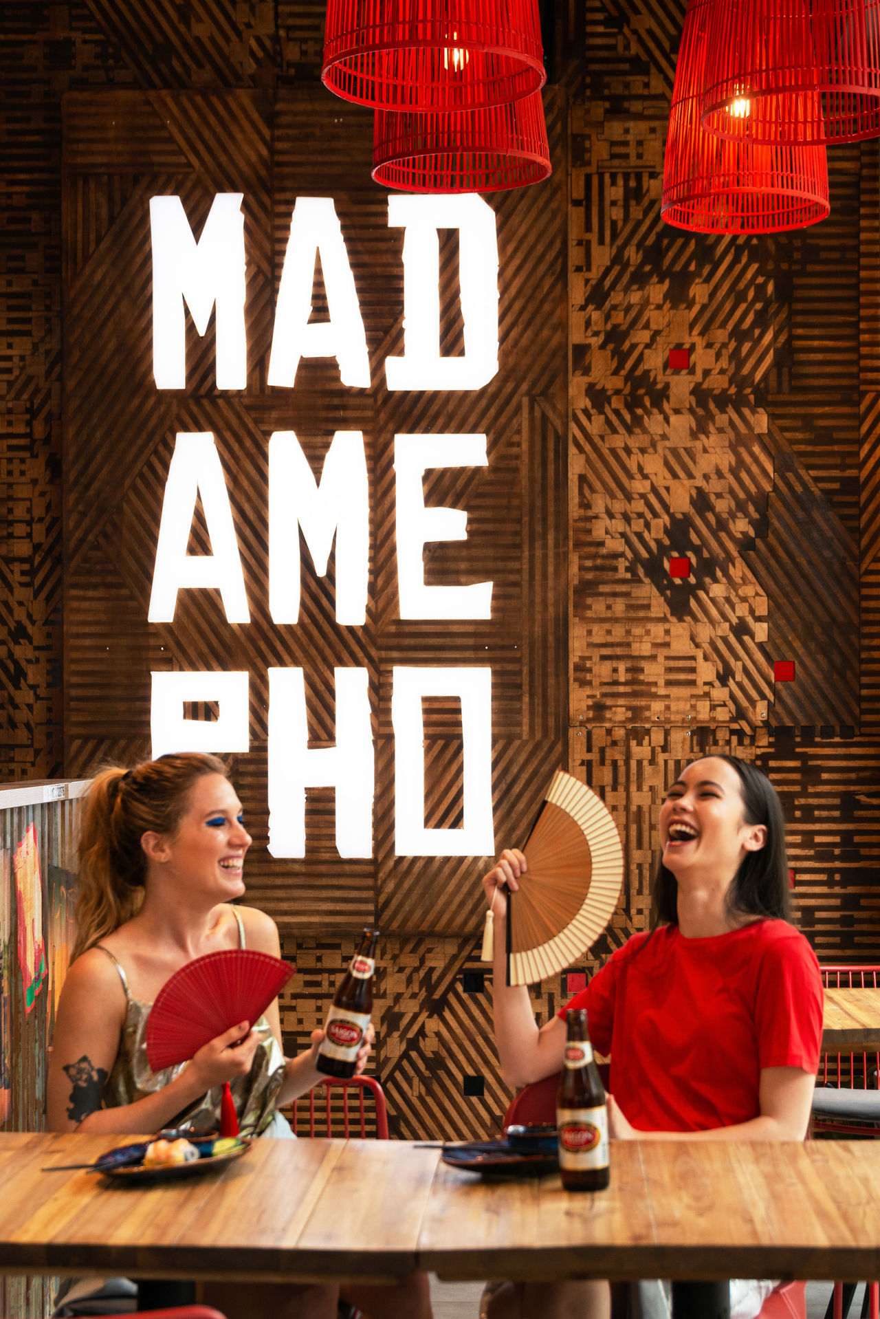
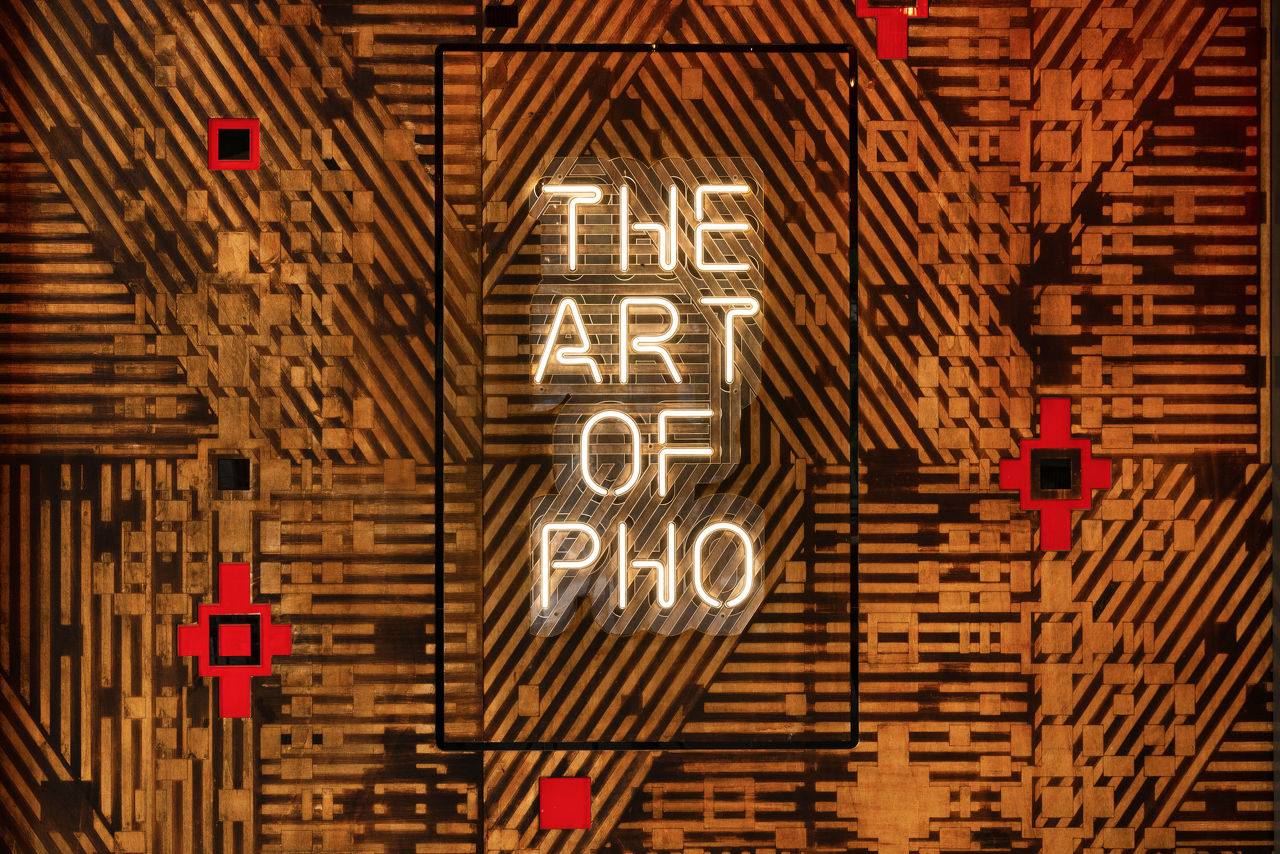
Madame Pho
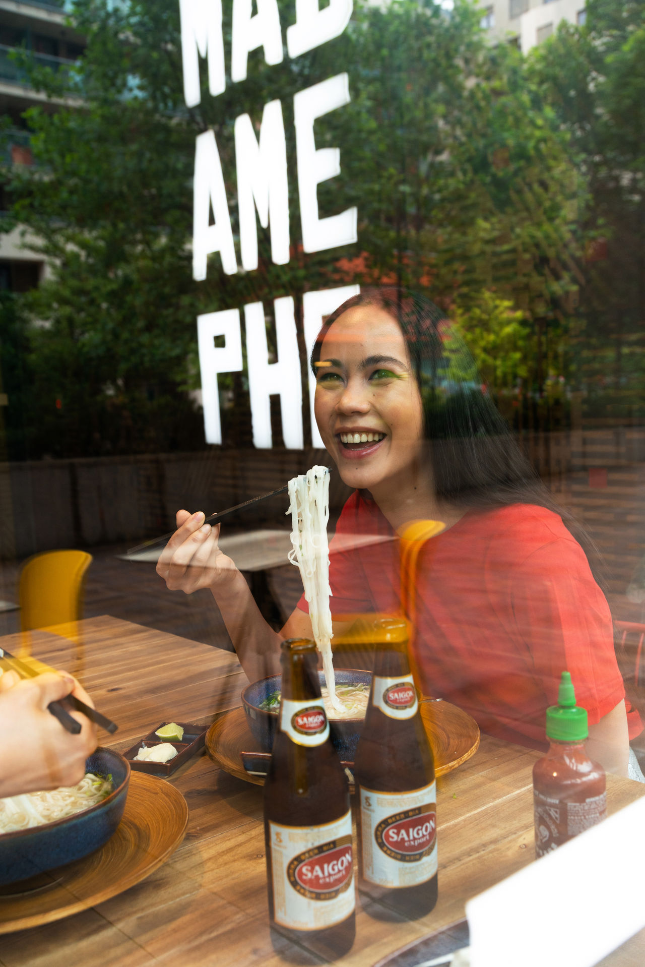
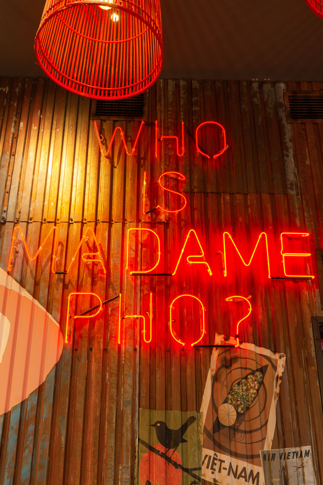
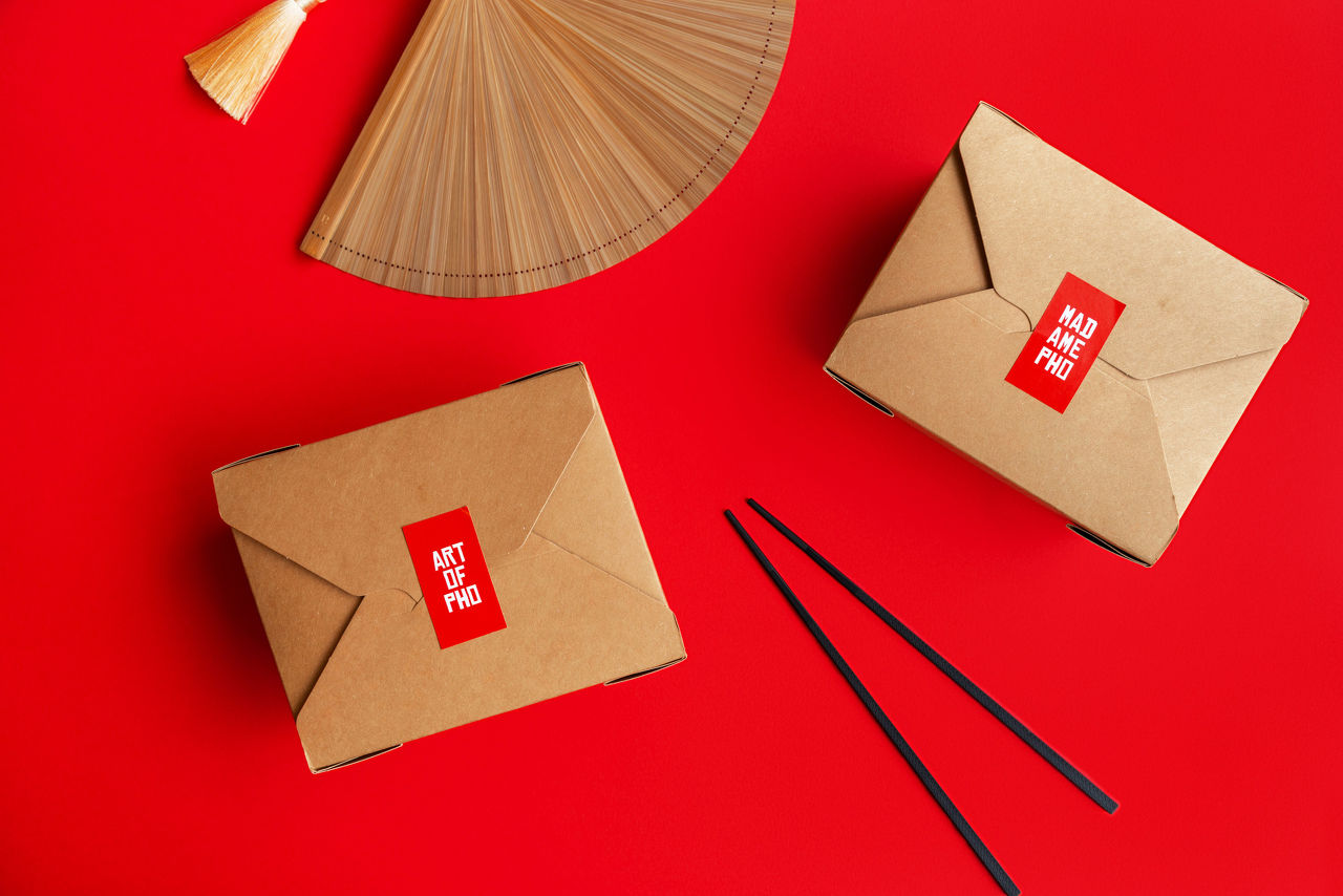
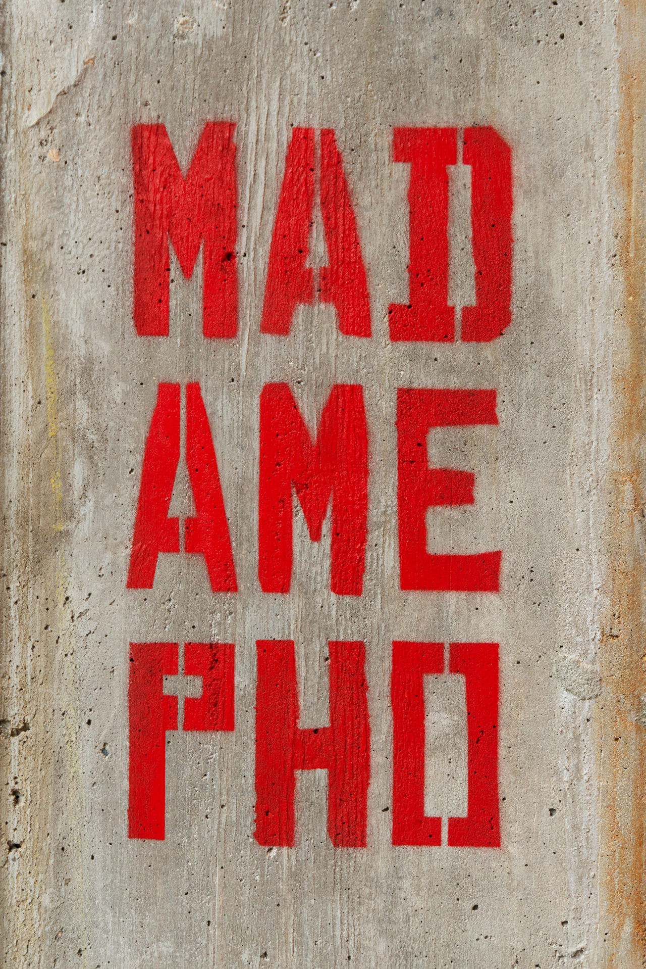
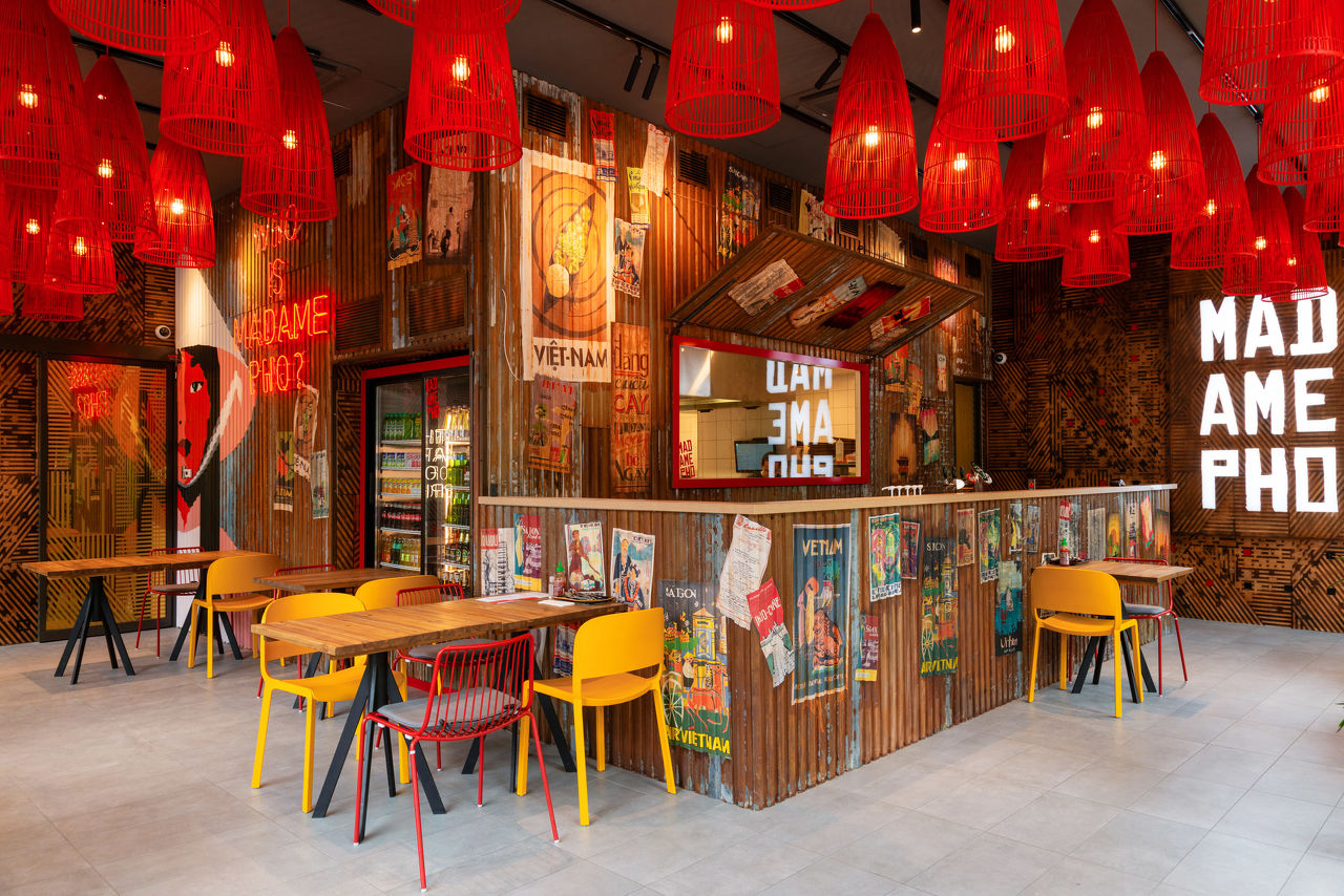
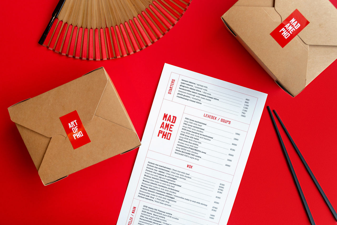
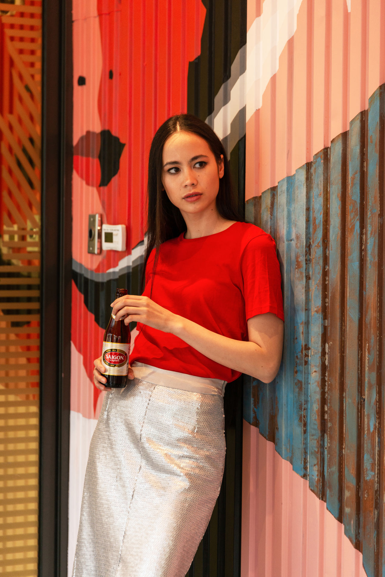
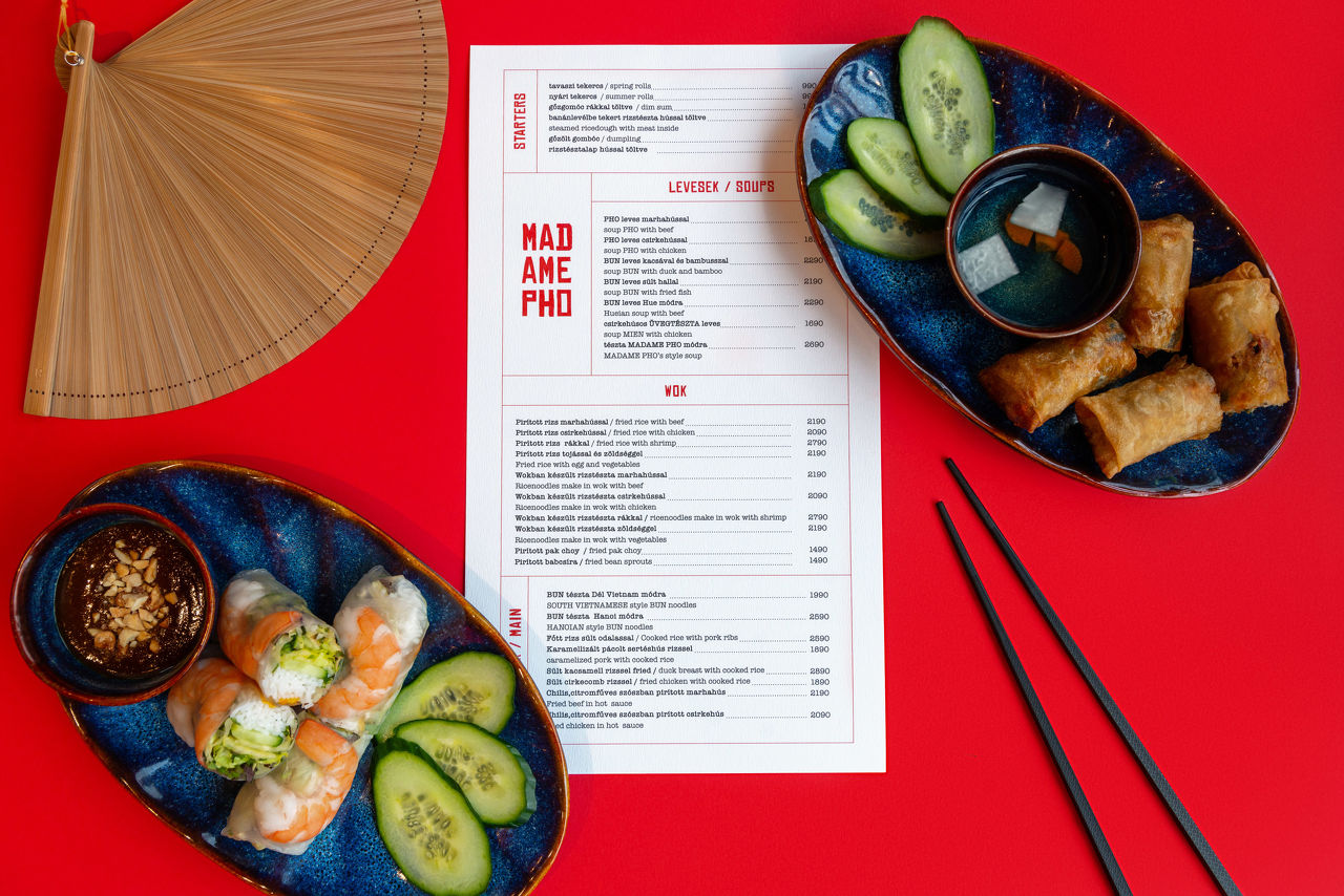
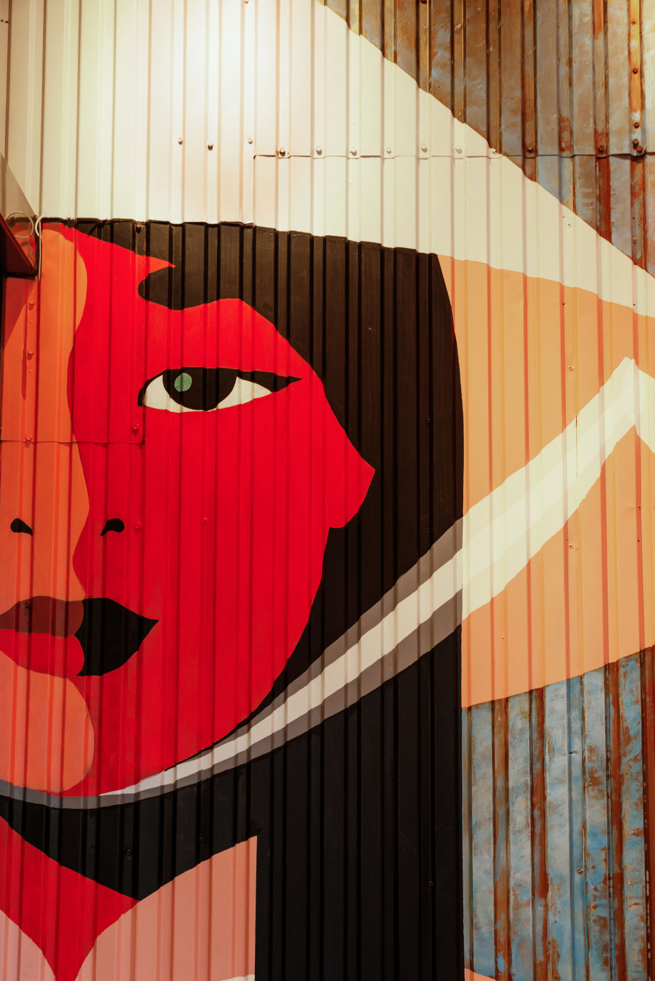
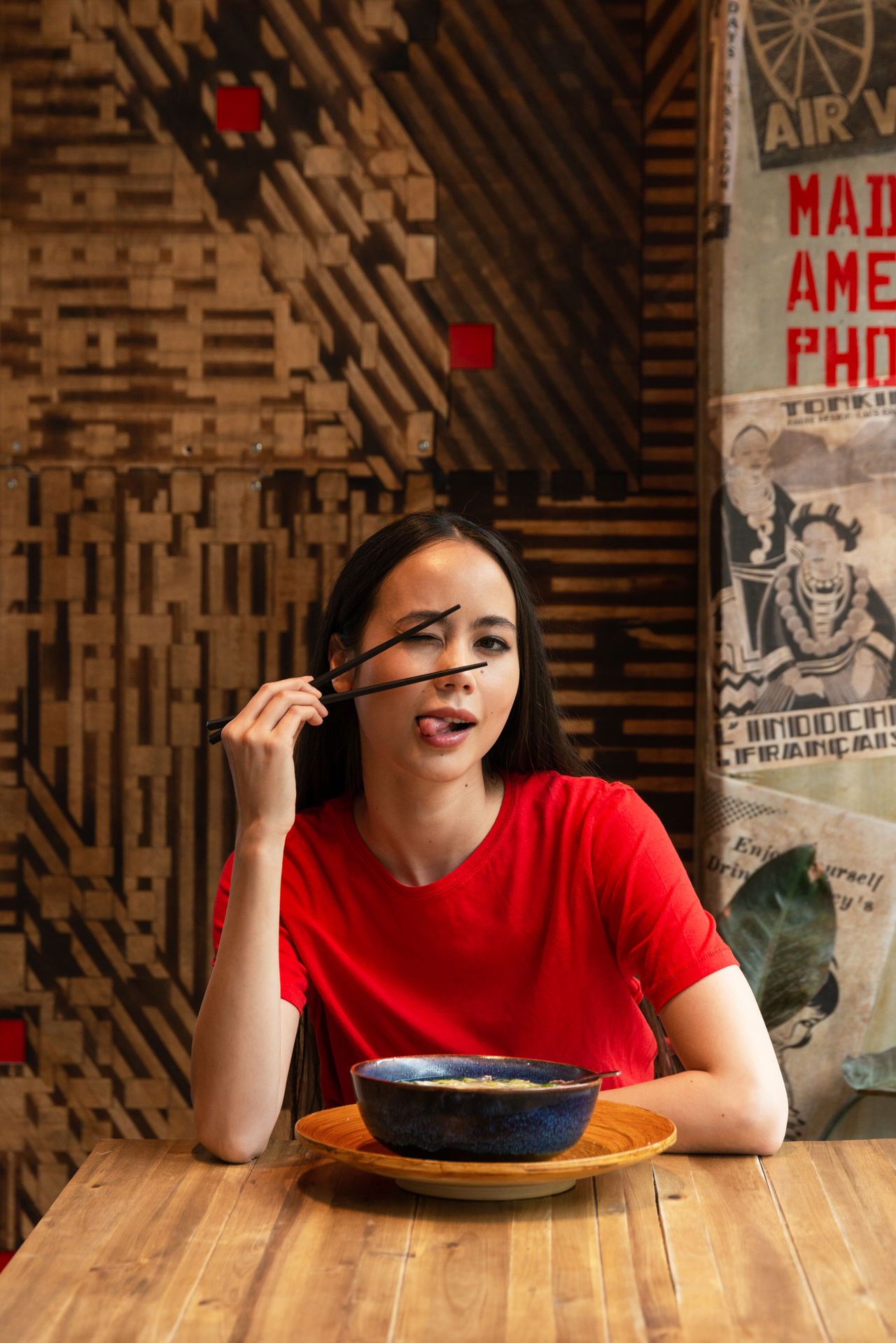
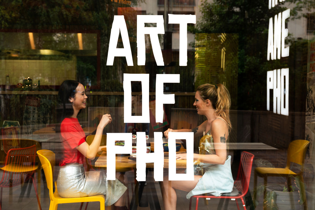
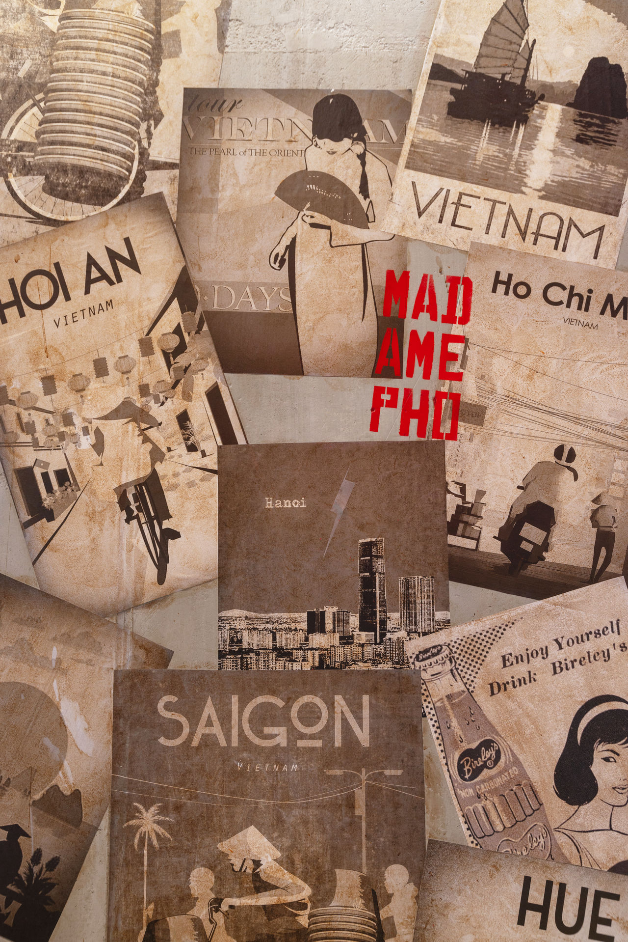
The first time we visited this place was in May 2019, when it was called King’s Pho and they asked us to design a few things for their walls. They were so impressed of our art director’s new logo and concept, that they decided to give us a free hand to reinvent the whole place. We created an interior in which we combined different Vietnamese styles, colors and vibes. Although the interior is really complex, the branding stayed simple and plain. An intense red color mixed with interesting typo and spacing. When we design a place, we always focus on the costumer experience as well. We wanted to make sure that the “Madame Pho feeling & lifestyle” comes alive in the place. We may be biased, but we think we did it.
services: branding, design
year: 2019-2020
client: MADAME PHO